Vitech: CampaignCenter
Case Study - B2B Product | UX and UI Design Lead
At Vitech Systems Group, we know proactive and targeted customer communications is paramount for success in digital marketing. We design and build CampaignCenter, a seamless self-service application with real-time analytics and configurable features to automate campaign activities and tasks. With enhanced dashboard, reporting and traceability features, our customers can plan, create, execute, and measure a successful campaign at ease. Our automated, configurable rules and logic support sophisticated segmentation of data. Any number of campaigns for an almost limitless number of purposes can be in process at the same time.
This product will be integrated with other Vitech products, such as CoreAdmin and DocCenter so that our customers can manage campaign tasks across three verticals – insurance, retirement, and investments.

Our Approach
Challenge
Our customers have existing, recurring business processes which are labor intensive and require multiple activities. Examples include enrollment participation, upselling and cross-selling products, increasing digital engagement, and fulfilling compliance needs. Each of these activities can require their own result conditions which result in further subprocesses.
Step 1Revisit MVP requirements
I worked closely with product managers to layout all types of customers and their processes and goals in each epic.
Five Epics
New Campaign Setup
Active Campaign
Homepage
Segmentation / Data Source
Activity Management for an Active Campaign
Competitive Research
MailChimp
Adobe Marketing Cloud
Hubspot
Iterable
Hive

Step 2Sketch
I encouraged engineers, product managers, and other key stakeholders to sketch with our team and voted for their favorite sections with yellow stickers in InVision. This practice helped to clarify the project for all, and create a sense of shared ownership.

Step 3Design and Validate Concept through User Testing
I digitized the Active Campaign flow and built a prototype for user testing.
We invited 5 test participants with marketing expertise. All participants successfully completed the task flow to manage the campaign using my design concept.
Step 4Overall Usability Findings
All 5 test participants successfully completed tasks on the ‘Summary’ tab. Bulk of testers wanted the default to be the ‘Percentage’ view of summary stats and see more information related to data trends.
3 of 5 participants successfully completed tasks on the ‘Activities’ tab. Number of participants found the name of the tab to not resonate with a term they would use for managing outbound correspondence.
2 of 5 participants successfully searched for existing audience segments on the ‘Audience’ tab and 3 of 5 were not able to navigate to the segment creator on the first attempt.
All 5 test participants successfully navigated to and interacted with the Campaigns ribbon for navigating between campaigns.

“Active Campaign” Experience
We asked our participants to rate the overall experience on a scale of 1 - 7 (1= Very dissatisfied, 7 = Very satisfied)
Satisfaction Rating
5.6/7
The list of the adjectives used to describe the experience are,
Colorful, Clean, Minimalist, Flexible, Common UI, Light, Airy, Easy, Intuitive, Aesthetically Pleasing, Simple, Clear and Organized.
Final Design

Summary - View by Percentage

Summary - View by Number

Quick Navigation through Ribbon

Correspondence Manager

Audience

Select Segment

Edit Campaign
RELATED WORKCreate New Campaign Epic
We used the same process to validate our concept for New Campaign Setup Epic.
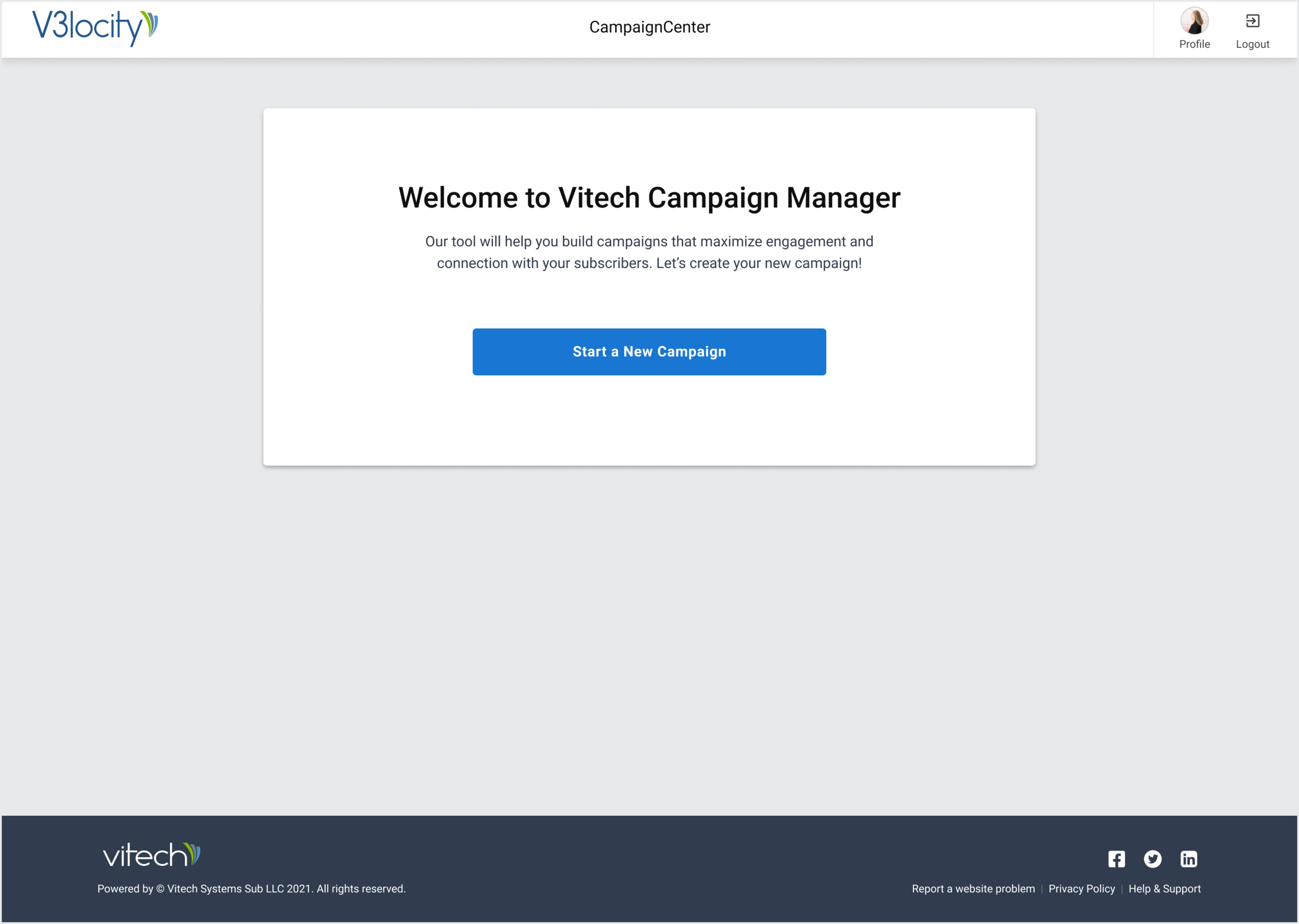
Landing Screen for First-time User
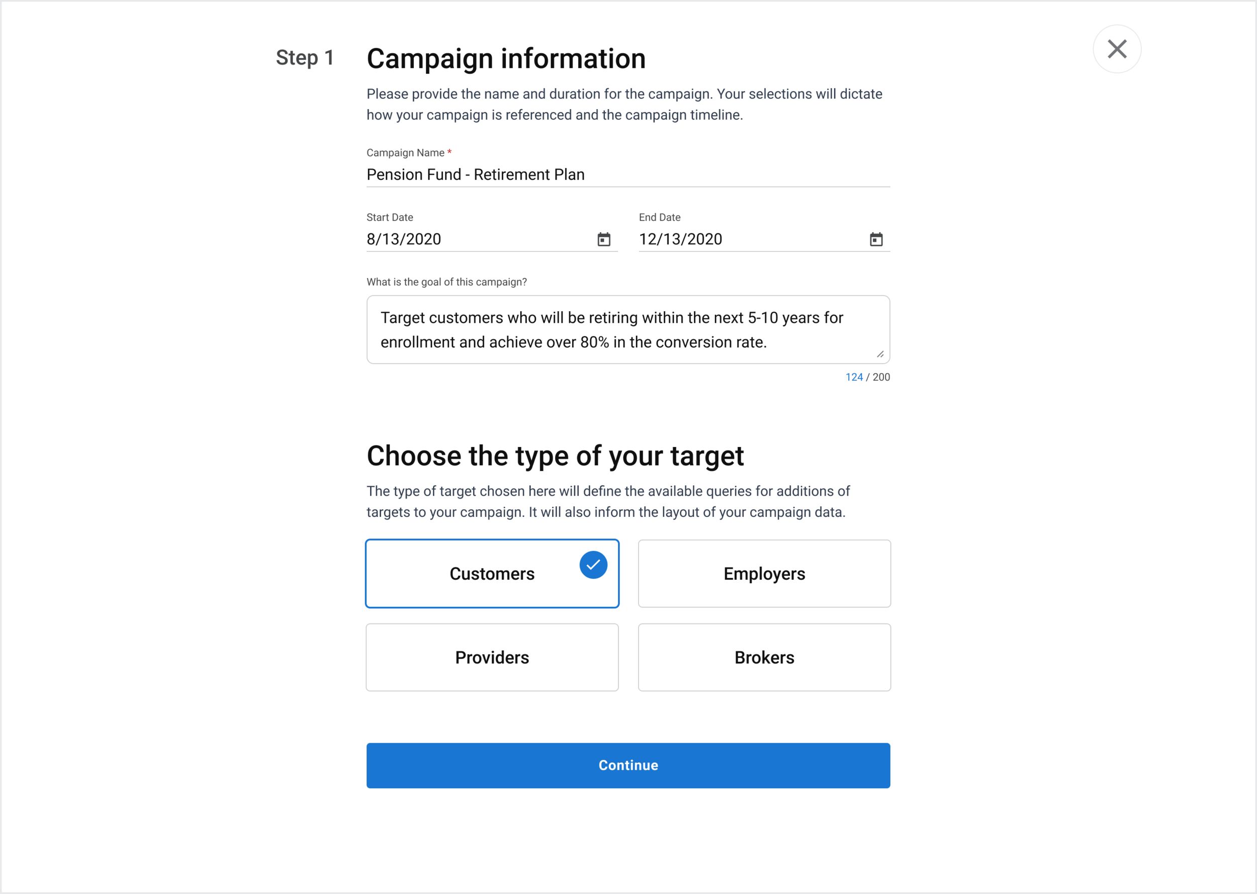
Step 1 - Campaign
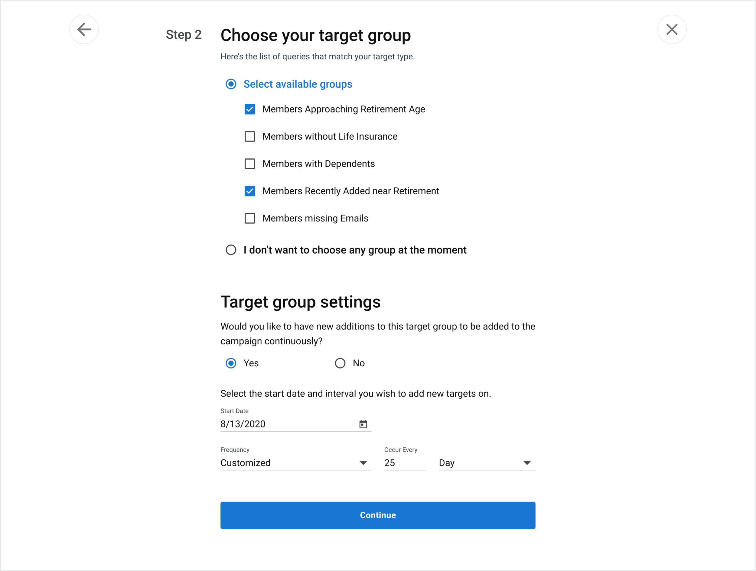
Step 2 - Target
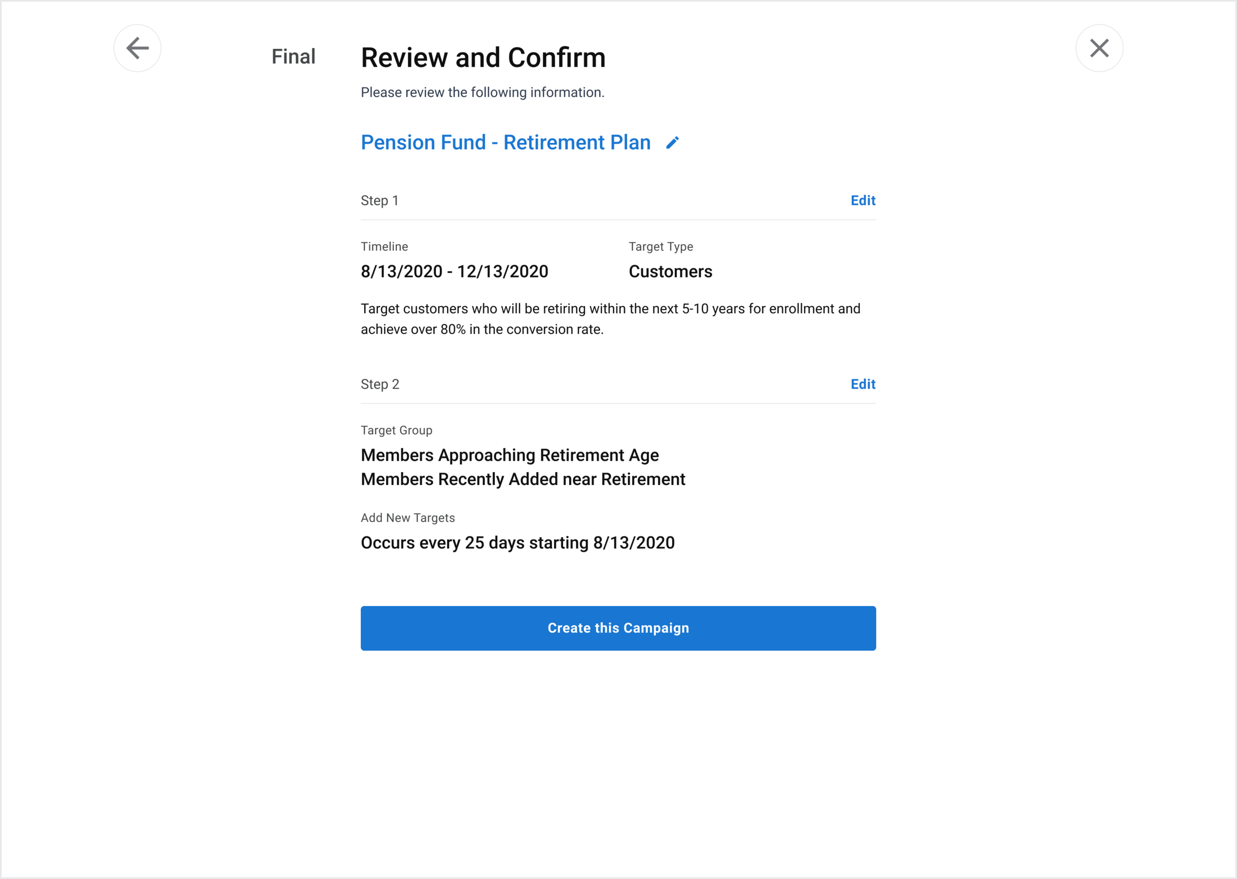
Review and Confirm
Overall Usability Findings
All 5 test participants successfully completed the task flow of creating the campaign as the first time user of the app’s UX concept, from the initial screen with the text copy and the CTA button being contextually clear, to setting up the campaign name, start/end date of the campaign, specify the goal of the campaign, selecting appropriate target type, then choosing relevant target group, and performing additional interval settings, then clearly understand the information that’s being displayed on the review & confirm screen.
2/5 test participants didn’t realize that they should scroll vertically downward to be able to select the target type perhaps due to the vertical whitespace between the sections on Step 1 screen.
All 5 participants successfully completed the task of choosing the target group(s) on Step 2 screen.
2/5 participants were not aware they could change the frequency value on Step 2 screen. This may have been more to do with prepopulating fields on the prototype and less with the prototype itself.
2/5 participants were not aware that the CTA button ‘Edit’ on the ‘Review and Confirm’ screen would change the page they were on
2/5 participants did not use the ‘Return to Confirm’ CTA button on page 1 to skip to the Confirm screen
All participants successfully clicked the pencil icon to change the name

“Create New Campaign” Experience
We asked our participants to rate the overall experience on a scale of 1 - 7 (1= Very dissatisfied, 7 = Very satisfied)
Satisfaction Rating
5.75/7
The list of the adjectives used to describe the experience are,